
What Is Typography?
Typography is both an art and a technique. Up until recently created through old-school printing techniques, typography is all about arranging type (letters or characters) in a way that enables learning and recognition.
Typography is absolutely everywhere, just look at your phone, a billboard, your coffee cup, or even the different styles used in this blog post. Once you’re conscious about the fact that typography is all around you, you’ll start to recognise the differences between typefaces and why they are so important to your brand and your marketing across all platforms.
DID you know that over 200,000 fonts exist in the world?
Helvetica is one of the most popular and most commonly used typefaces because it works well when used in a variety of ways, for every typographic project imaginable. But we’re curious as to where it came from and what made it so popular today?
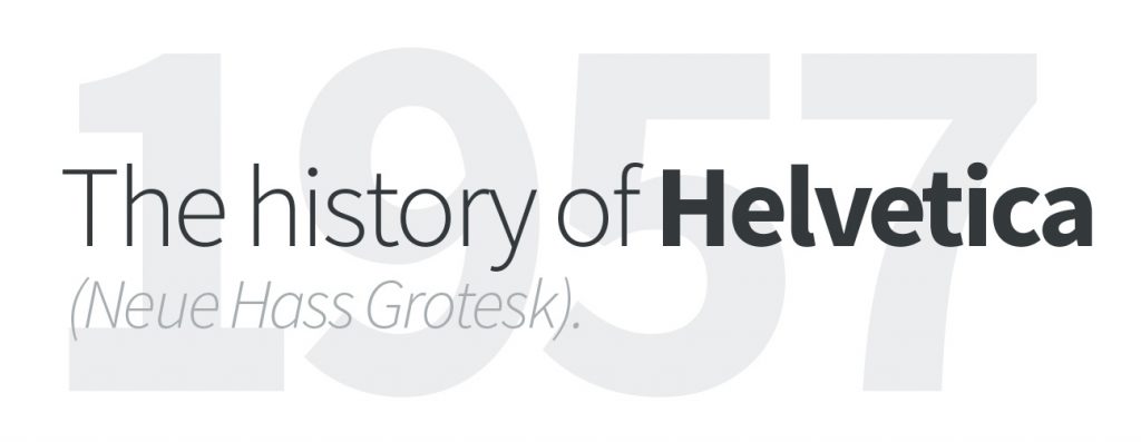
The first version of Helvetica was created in 1957 by Max Miedinger, a Swiss typeface designer. His goal was to design a new sans-serif typeface that could compete in the Swiss market with the goal to create a neutral typeface that should give no additional meaning. Miedinger wanted a font that was clear to the eye and could be used in a variety of ways. It was originally called Neue Hass Grotesk. In 1960, the type face’s name was changed to Helvetica, which means “Swiss” in Latin. This was seen as more marketable internationally.
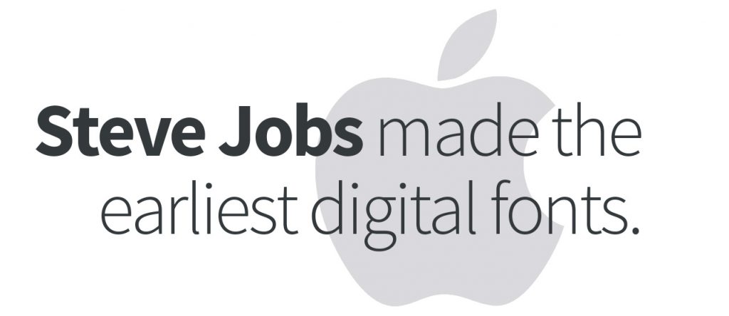
After Steve Jobs dropped out of Reed College, he took classes in calligraphy. These calligraphy classes inspired him to offer different typefaces for his personal computer line, the Macintosh.
Jobs named the fonts after his beloved cities, namely: Chicago, Geneva, London, Los Angeles, Toronto, San Francisco and Venice.
5 Fun Font Facts:
1. The first sans serif typefaces appeared in print in the early 1800s, around 140 years before Helvetica was designed. However they were ridiculed at the time for being ugly, and it was to be almost a century before sans serifs would come into regular use.
2. You trust a typeface depending on the context you see it in. Baskerville has been proven to be more believable than Helvetica or Comic Sans in an experiment with the New York Times, yet Helvetica is rated as the most trusted of the three on a road sign. Comic Sans scores as the most believable poster for a school party.
3. In the 1800s display typefaces designed in London were given names like Egyptienne, Tuscan and Italienne, although their design had nothing to do with these locations. This was a marketing ploy because these were fashionable travel destinations.
4. IKEA has only ever changed their font once. In 2009, IKEA changed its logo font from Futura to Verdana. Before the switch, IKEA used an adapted version of Futura called IKEA Sans. However, they decided to make the switch when they realized that IKEA Sans couldn’t support Asian characters.
5. The word typeface refers to different lettering designs, each variation (bold, italicised, underlined) of a typeface is referred to as a font.
Gotham : Barack Obama’s
Favourite Font.
Can the right font make the difference in a media-driven election?
Barack Obama’s campaign used the font Gotham for their “Change We Can Believe In” banners and other material. In this outtake from Gary Hustwit’s 2007 documentary “Helvetica”, type designers Jonathan Hoefler and Tobias Frere-Jones discuss the creation of Gotham. The font was originally commissioned for GQ Magazine, and the list of qualities they were looking for then sounds surprisingly Obama-esque now.