
"I don't see flat design as a new trend, I see it as the logical solution to a universal problem created by a different trend."
Dan Beckett, Lead Designer, Toyota.
Design trends are an ever-changing feast, and more recently we’ve seen a number of automotive brands evolve, from the three-dimensional, chrome effect logos of the 80’s and 90’s to a more simplistic, two-dimensional, flat logo design.
The most recent evolution is that from car maker Peugeot, in a bold move, to mark a new era of electric car manufacturing. Taking inspiration from their 1960's style lion emblem, Peugeot has ditched the previous silver-toned lion in favour of a clean, modern, monochrome design set on a shield. It’s minimalistic, yet somewhat more upmarket. A decidedly new direction for the brand.
Of course, with many rebrands, the change has divided opinion, however the switch to simplicity makes sense. A logo needs to work across websites, social media and various types of digital media as well as a car bonnet, and in the case of Peugeot, the new branding will be introduced on the new 308 hatchback immediately.
We’ve rounded up other examples from the automotive world and take a look at the seismic shift as designers ditch the three-dimensional logo in favour of flat designs to retain relevance in the digital age.
MINI
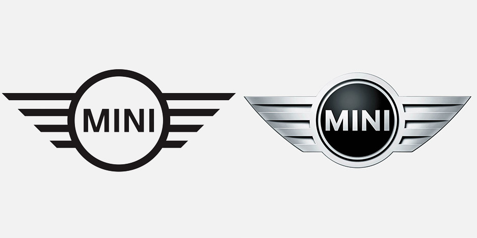
MINI was one of the first car brands to switch its logo to a new, minimal 2D monochrome version of the double-winged symbol from the 80's. Unveiled in 2015, the flat version of the emblem will be used on screens and paper, while the vehicles will still retain the 3D chrome-style iteration of the logo.
The logo redesign was accompanied by a new serif font called MINI Serif. The two updates, together, were launched to make it look like MINI was "entering a new era," according to head of design Anders Warming.
VOLKSWAGEN

Formerly 3D and featuring a chrome-effect, Volkswagen reduced its logo to its basic elements in September 2019. The new flattened version was the brands first major change to its visual identity, since adopting the 3D design in 2000.
Introduced as part of the launch for the ID.3, its first fully electric production car, Volkswagen stated its updated ‘digital-first’ branding, would mark the ‘start of a new era’.
BMW
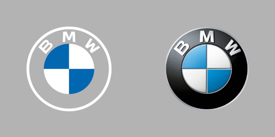
In March 2020, BMW unveiled a minimalist redesign of its logo, revealing a new, transparent backdrop. This was the first overhaul of its iconic emblem, since 1997.
The logo was flattened, removing shadows on both the black ring and the blue and white inner circle. By introducing a transparent band, the new design takes on different colours and patterns depending on the background on which it is placed.First featured on BMW's electric Concept i4 vehicle, the logo definitely divided opinion.
CITROËN
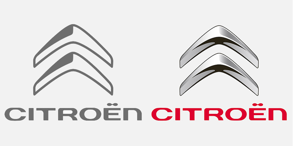
French carmaker Citroën made way for a flat monochrome design in 2016. By removing the chrome effect from its two chevrons, they hoped to achieve more visibility - Citroën also removed the distinctive red colourway from their name at the same time.
Citroën was slightly late in jumping on the 3D wagon, having only replaced its former flat logo from 1977, with the raised, metallic design we've all come to know, in 2009.
"This choice of graphics is in line with the current 'flat design' trend for simplifying signs," said Citroën. "Using just one colour it offers new graphic opportunities and gives the brand-new impetus."
NISSAN
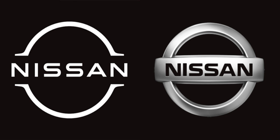
Japanese car brand Nissan, have only recently updated its logo, launching a flat and more stylised version of its previous emblem, which boasted a raised, life lie badge effect.
The company name still sits front and centre, but the former circle has been simplified into two basic lines. The new logo is more "digital-friendly" according to the automaker and was the first time it had changed its visual identity in 20 years.
AUDI
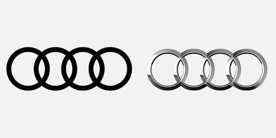
German automaker Audi, flattened the recognisable four, interlocking rings in 2017, moving from 3D to 2D. The rings were initially designed to look like they were made from a reflective metal material.
In 1995 Audi made the switch from 2D to 3D, only to revert back to form. The decision again was to reposition the brand in a digital first age, improving readability across all online platforms.
Most recently, the car brand has launched an interactive tool that allows people to change the thickness of the rings in a bid to make its visual identity "more accessible".
TOYOTA
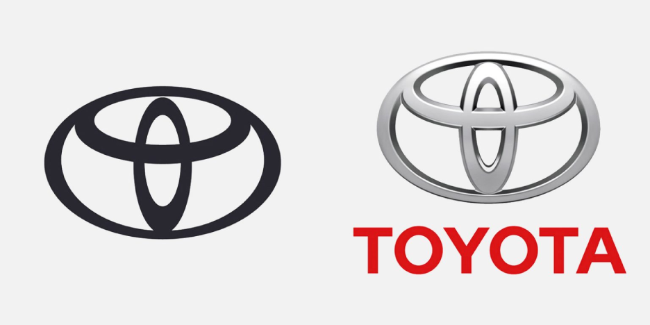
The Toyota logo is instantly one of the most recognisable in the world of automotive, however they too have joined the party in unveiling a simplified, 2D embed made up of three overlapping ovals.
Having first changed its logo from 2D to 3D in the late 1980's, the Japanese auto company recently reverted back to the old flat design to ensure "longevity in a digital world".
This new visual identity also involved the removal of its word-mark, as a marker of Toyota being "one of the most recognisable brands in the world".
"With the advent of digital brand touchpoints and especially small mobile screens, all those fiddly bevels and gradients meant the logos became little grey smudges, indistinguishable from one another," explained Dan Beckett, lead designer of Toyota's latest logo.
"I don't see [flat design] as a new trend," Beckett added. "I see it as the logical solution to a universal problem created by a different trend."
So, there you have it. With brands trying to gain momentum within the new clean, electric era of travel, cutting out the clutter from the core of their brands visual, the logo, could help subliminally reinforce what they want you to believe. However, more than anything, we believe that flat design allows the ideal balance between form and function, which is why there is seismic shift towards it.
For logo design enquiries, visit https://rhinogroup.co.uk/creative/